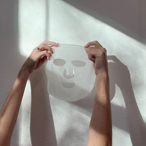
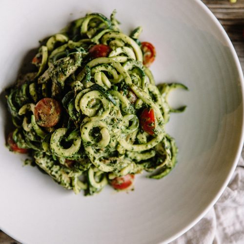
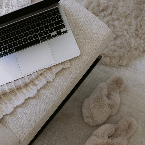
Last year I started receiving questions and inquires on how I achieve the “perfect flat lay image” (or lay flats, whichever you prefer!) that flood my Insta page. Today, I’m sharing 4 simple steps to help you create them!

Whether you are a creative entrepreneur looking to provide a more consistent look and feel to your social presence, or want to make your personal photos a little better, these 4 tips will help you create that Insta-worthy shot.
For a long time I struggled with this, but it was a lot of trial and error, playing around and listening to what others had to say. After some time, I’ve been able to find what works best for me and my aesthetic. Follow these simple steps to create a visually consistent story on Instagram.
4 Steps to Achieving the Perfect Flat Lay Image
Get a flat surface

This can be a foam board, colored construction paper, a piece of wood you paint, whatever works for your brand aesthetic! I usually prefer plain white backgrounds. I have two large white foam boards and one in black – just in case!
Take your photo in natural light
This may seem like a no-brainer for all the photographers out there, but for my wedding planners, cake designers, bloggers and fellow creatives who are not used to really operating a camera, take your flat lay image outside or near a window. This piece is soooo important! To ensure I get the best picture, I move around my house depending on the time of day I am snapping the photos. I am pretty sure my neighbors think I am crazy. To capture these photos I went to my front porch, staging, styling and snapping photos all while people were walking by looking at me wondering what the heck I’m doing!
Be sure to take your photo in even light, you don’t want any harsh shadows appearing in your image – they’re distracting and take away from the items in the picture. This means, avoid having the light source above you and the image. If the light is coming from above, then your phone or camera will create shadows over the things you are trying to take a picture of.
Shoot in square mode

If you are using this image specifically for Instagram or social media, use the square mode to take the picture, this will eliminate having to crop it after and allows you to easily adjust the items being featured because you’ll see the final image layout before you take the photo and crop it. This allows me to see if I need to play around with spacing or negative space.
Use a photo editing app
I use PicTapGo and/or A Color Story to edit my photos. I love PicTapGo because it allows me to customize and adjust the settings for the filters I select. Once you find a “recipe” that you like and works for your brand, keep using it! This will help you create a feed that aligns with your color tones and style.
[disclaim]If I am taking flat lay images for the blog, I use my “nice camera” and edit the photos in Photoshop.[/disclaim]
And that’s it! A super easy way to get your social game on point.

I remember when I showed off the final image during a workshop with our Tuesdays Together group, someone said “oh my gosh, it is all lies!” {insert laughing / crying emoji} – yes, it’s true, my desk is not a white foam board surface 😉

Have questions about the process? Let me know in the comments below!


